


Quick Answer
A good call to action is specific, singular, immediately visible, and tied directly to what your business needs visitors to do. The most common reason small business websites fail to generate leads isn’t missing copy or bad design — it’s the absence of a clear, prominent CTA that tells visitors exactly what to do next. If your site has one and it’s working, everything else is optimization. If it doesn’t, that’s the first thing to fix.
A call to action (CTA) is the one thing you’re asking your website visitors to do before they leave. Not three things. Not a menu full of options. One clear directive that moves both the visitor and your business forward at the same time — booking a consultation, requesting a quote, placing an order, signing up for a service. Many visitors skim, and about 90% of website visitors only read headlines and CTAs.
It sounds obvious, but the lack of a clear CTA is the most common problem we find when auditing small business websites. The site looks professional, the services are described, the contact page exists — but there’s no moment where the visitor is told what to do next. And most visitors, given no direction, won’t invent one for themselves.
If you’re a small-to-medium sized business owner or marketer trying to generate more leads from your website, this is where conversion problems usually start. Below, we’ll break down what makes a good call to action, show examples for different types of businesses, explain why CTAs like “Contact Us” often underperform, and cover when to use sub-CTAs and lead magnets instead.
What Makes a Good Call to Action? The Two-Part Test
A strong call to action passes two tests simultaneously, and the language usually starts with a clear action word so the next step feels immediate:
-
It serves the visitor — this is the CTA’s value proposition, offering something useful or removing friction, and focusing on benefits rather than just the click tends to improve response rates (a free quote answers a question they already have; an easy booking removes the barrier of calling during business hours)
-
It fuels the business — it drives the desired action that generates revenue or leads, not just engagement
Good CTAs ask for one specific action rather than a vague next step.
When you write CTAs, strong, action-led language helps create more actionable language and has been shown to lift conversion rates by about 12.7%.
A CTA that only serves the visitor (“here’s our full service list”) informs but doesn’t convert. A CTA that only serves the business (“contact us about your needs”) asks without offering. The ones that work do both at once.
Good CTAs by Business Type
For e-commerce and product businesses
The goal is getting visitors to the point of purchase for direct sales with as little friction as possible, so the CTA should match the intended action of buying.
-
Shop Now — direct, unambiguous, works for almost any product category
-
Featured / New / Sale Products — gives visitors a reason to click before they’ve decided to buy
-
Get [X]% Off — discount CTAs paired with email sign-up drive both first purchases and a long-term marketing list
Simple cta based experimentation on e-commerce landing pages can reveal which purchase prompt converts best.
On a product landing page or web page, a contrasting cta button often outperforms a plain text link for purchase-focused actions.
For example, in a display ad or Google Ads campaign, a purchase CTA like “Shop Now” should stay consistent from ad to page. The same applies to a facebook ad, where the landing page should repeat that purchase-focused prompt. Likewise, instagram ad ctas tend to perform better when the tap leads straight to the promised next step, such as buying or browsing products.
For service-based businesses
The goal is turning an anonymous visitor into a named lead: CTAs aim to drive leads by collecting contact details for follow-up.
-
Get a Free Consultation (backed by a short form)
-
Request a Free Quote
-
Book an Appointment
-
Sign Up Today
For service businesses, clear CTAs matter even more because visitors often need reassurance about the next step.
The best service CTAs answer a question the visitor is already asking. The strongest ones also reflect what the target audience most wants first. “Get a Free Quote” works for home services because price is the first thing someone researching a remodel wants to know. The desired action should also match the buyer’s journey, since some visitors want a quote now while others are only ready to ask questions. The CTA should encourage people to take the next step that fits their readiness, whether that means asking a question or requesting a quote. “Book an Appointment” works for healthcare because the action is the entire reason someone visited the site.
Why “Contact Us” Rarely Works as a CTA
“Contact Us” is the most common CTA we see on small business websites, and it’s almost always the weakest option.
Here’s the problem: it asks the visitor to do something for you (reach out) without offering them anything in return. It doesn’t promise anything useful — no quote, no consultation, no answer to a specific question. It also lacks a sense of urgency and gives no reason for immediate action. Because it doesn’t point to a specific action or concrete outcome, it feels vague. It’s the equivalent of a store employee saying “come talk to us” instead of “here’s what we can do for you.”
There are narrow cases where it works — professional services where every engagement starts with a conversation, for instance — but even then, a great call to action gives the visitor a clear benefit, not just a request to make contact. “Schedule a Free Consultation” outperforms “Contact Us” because it’s specific and it tells the visitor what they’re getting. Wording like “Schedule a Free Consultation Today” uses urgency tactics and time-sensitive language to create urgency without sounding pushy, and CTAs like that can lift conversion rates significantly.
Before defaulting to “Contact Us,” ask: what does a visitor actually get by reaching out? Whatever the honest answer is — a quote, a diagnosis, a recommendation, a conversation with someone who can help — that’s the difference between a weak prompt and a great call.
Common CTA Button Mistakes on Small Business Websites
No CTA at all. The page has services, a phone number, a contact page in the nav — but no moment where the visitor is explicitly asked to do something. CTAs can be buttons, links, or plain text prompts, but one clear prompt has to exist. This is the most costly mistake and the easiest to fix.
Too many competing CTAs. “Schedule a consult” + “download our guide” + “follow us on Instagram” + “chat now” on the same page means none of them gets prioritized. Every extra option increases the chance a visitor does nothing. multiple cta buttons can work when one is clearly primary and the others support different stages of the decision process. On simpler pages, a single cta often reduces friction and keeps attention on the main action.
A CTA that disappears when you scroll. If your CTA is only in the hero section and the page is long, visitors reading further down the page have no prompt to act. Placing the main CTA above the fold usually improves performance. The best implementations keep the primary CTA accessible throughout — in a sticky menu, repeated in the body, or anchored in a footer bar. CTA buttons should also be large enough and touch-friendly on mobile devices.
A CTA that blends in. A button that matches the background color, sits in small text, or competes visually with everything else on the page won’t get clicked. A call to action button often earns more clicks than plain text: button-based CTAs increase click-through rates by around 30%, and one study found that adding a CTA button increased conversions by 83%, which is why an effective CTA needs strong contrast and clear placement. ctas surrounded by white space and minimal clutter are easier to notice and click. In some tests, first-person CTA phrasing increases engagement. The CTA should be the most visually prominent interactive element on the page. Design choices should reflect user behavior, since visitors usually click what feels most obvious and easiest to do.
Real-World CTA Examples That Work
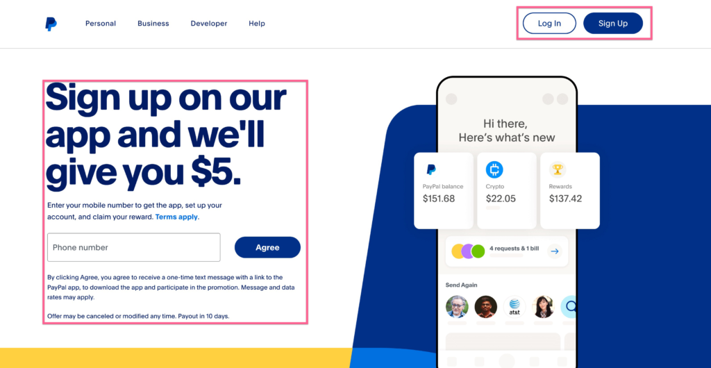
Sign Up — PayPal PayPal’s homepage is built around a single action, and this call to action example works because it matches the business goal and the context. It also works because the layout directs users to the most relevant next step depending on whether they are signing up or logging in. The primary CTA appears in the hero, the form accepts a phone number immediately (zero friction to start), and the same CTA is available throughout the page for returning visitors who need to log in instead. The page also uses action phrases that make the next step feel immediate and low-friction. Within two to three seconds of landing, it’s completely clear what PayPal wants you to do — and why it benefits you.

Reach Out Today — Stewart IP Law Slightly softer than a typical “contact us” button, but paired with context that explains why reaching out is useful: so the firm can assess your case. For legal services, where every engagement requires a conversation before a commitment, this framing works. The wording makes the offer feel like it’s just what a worried visitor needs in that moment. The CTA serves the visitor (they get a case assessment) and the firm (they screen for qualified leads).

Get a Free Quote — Reece Builders For home remodeling, price is the first question in almost every prospect’s mind. A free quote CTA answers that question directly, removes a barrier (“I don’t know if I can afford this”), and generates a lead in one move. The sticky menu keeps the CTA visible as visitors scroll through project photos, so the prompt is always available when inspiration strikes.
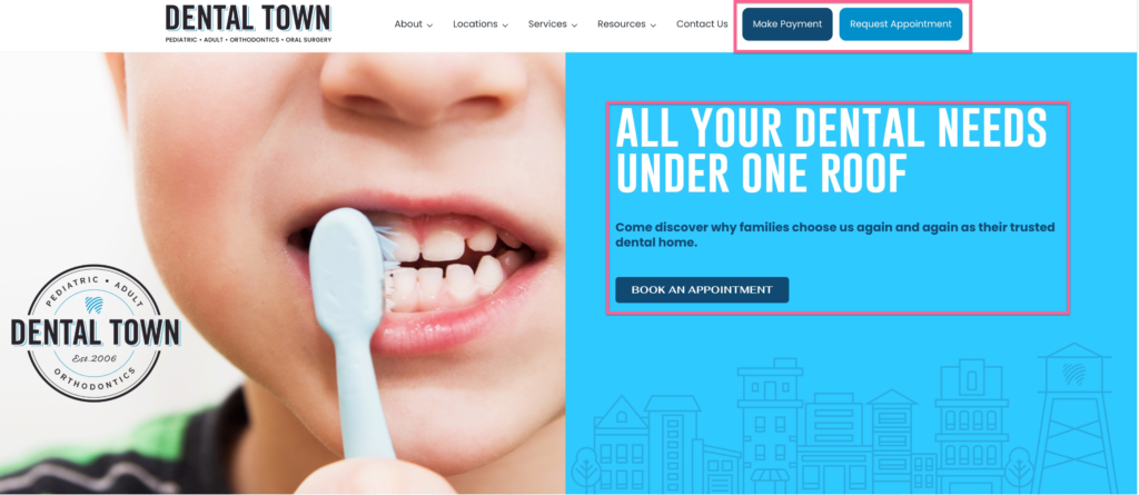
Book an Appointment — Healthcare For medical and dental practices, booking an appointment is the conversion. A clear, always-accessible “Book an Appointment” button serves new patients (easy first step) and existing ones (easy return visit), and a secondary “Make a Payment” CTA serves a different but equally important function for the business — while showing how personalized CTAs often beat generic prompts, with some studies reporting 202% better performance when personalization in CTAs aligns with user intent. In higher-stakes situations like healthcare, the right words can also provoke emotion by speaking to urgency, relief, or peace of mind.
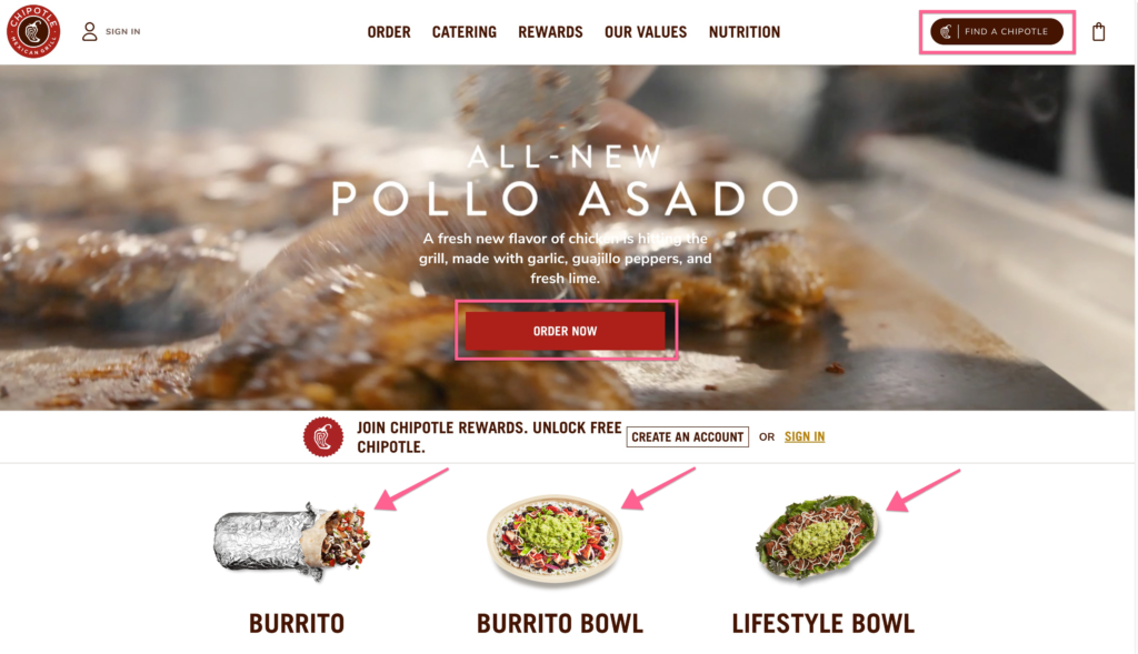
Order Now — Chipotle Chipotle’s homepage exists for one reason: online orders. The CTA appears in the hero, the images link directly to the ordering system, and the menu includes a “Find a Chipotle” sub-CTA to capture visitors who’d rather order in-store. Every element serves a single objective — and they don’t hedge by burying it under brand content.
A donate money CTA works the same way in nonprofit campaigns, where the promised impact needs to be explicit before people act.
In app and gaming ads, play game is effective when the value proposition is instant entertainment.
What Is a Sub-CTA?
A sub-CTA is the second-most-important thing you want a visitor to do if they’re not ready for your primary CTA. Even as a secondary step, it should still ask for one specific action.
Most visitors won’t convert on their first visit. A sub-CTA captures those visitors before they leave entirely. Some businesses use pop ups, including exit intent pop ups, as a last-chance sub-CTA when a visitor is about to leave — usually by getting them into your email list, where you can continue the conversation over time across emails, pop-ups, and other marketing materials.
The most common sub-CTAs for small businesses:
-
Join our newsletter
-
Download a free resource like a guide or checklist
-
Sign up for updates or offers
-
Watch a demo or tutorial
In some cases, first-person sub-CTA wording can lift conversions by making the offer feel more personal.
First-person CTA copy such as “Send me the checklist” can increase engagement, and well-timed welcome gates can convert in the 10-25% range when used carefully.
The key is that the sub-CTA offers something in exchange for the visitor’s information. Which brings up the concept below.
What Is a Lead Magnet?
A lead magnet is something of value you offer in exchange for a visitor’s contact information — usually their email address. As Investopedia defines it, a lead magnet is a service or offering given in exchange for contact details, used to create sales leads, and many are promoted with concise cta copy that promises instant access to something useful. Lead magnets are a staple of digital marketing because they exchange clear value for contact information.
Your sub-CTA is typically the delivery mechanism for your lead magnet. The visitor clicks “Download our free checklist,” enters their email, and gets the checklist — you get a qualified contact, and lead generation CTAs work best when the wording is short, specific, and clear about the benefit. They also often support broader marketing campaigns by turning passive traffic into subscribers or leads.
Strong lead magnets are specific and immediately useful:
-
A checklist or template they can use right now
-
A discount code toward a first purchase
-
A short guide that answers a question they’re already asking
-
Access to a webinar or educational content
-
A free trial or sample
Your primary CTA can also be a lead magnet — “Get a Free Quote” exchanges a useful deliverable (the quote) for contact information and a sales conversation. When your main CTA does double duty like this, it’s especially powerful. Conciseness matters here too, since effective CTAs are often just a few words long, and this kind of offer can increase conversion rates by up to 83% when the value is immediate and relevant.
Frequently Asked Questions
What makes a good call to action on a website? A good CTA is specific, singular, visible without scrolling, and tied to one clear action that serves both the visitor and the business, directing them to a specific action rather than a general intention. The best CTAs answer a question the visitor already has (pricing, booking, sign-up) while generating a lead or sale for the business. The only reliable way to know which great CTA or cta language works best is to A/B test it.
What is the best call to action for a small business website? It depends on your business model. Service businesses typically convert best with “Get a Free Consultation” or “Request a Free Quote” — both answer a visitor question and generate a lead. E-commerce sites convert with “Shop Now” or product-specific prompts. The best CTA for your site is the one that matches what your best customers asked before they first reached out.
Why doesn’t “Contact Us” work as a call to action? “Contact Us” asks the visitor to do something for you without offering them anything in return. It’s vague (contact you for what?), it lacks urgency, and it doesn’t communicate value. “Get a Free Consultation” or “Request a Quote” outperform it because they’re specific and tell the visitor exactly what they’ll receive.
How many CTAs should a website page have? One primary CTA per page. In practice, one cta often outperforms multiple ctas, with some tests showing a single focused prompt can increase clicks by up to 371%. You can have a secondary (sub-CTA) as a fallback for visitors not ready to convert, but every additional equal-weight option reduces the chance any of them get clicked. Multiple CTA buttons can work only when one is clearly prioritized and the others do not carry equal visual weight. Prioritize ruthlessly — the page should have one clear spine.
What is a sub-CTA? A sub-CTA is the second-most-important action you want a visitor to take — usually capturing their email address if they’re not ready to book or buy, while the main action remains the primary goal and the secondary cta serves as the fallback. CTAs also appear across websites, emails, and other marketing materials. Newsletter sign-ups, free guide downloads, and discount opt-ins are common sub-CTAs.
What is a lead magnet? A lead magnet is anything of value — a checklist, coupon, guide, template, webinar, or free trial — offered in exchange for a visitor’s contact information. It powers your sub-CTA by giving people a reason to hand over their email, and it can also power your primary CTA (e.g., a free quote is itself a lead magnet).
Conclusion
Every example CTA above shares two traits: it’s immediately obvious within the first few seconds of landing on the page, and it serves the visitor while generating something for the business. That’s the framework. Find the action that does both, make it the most visible thing on your page, and don’t dilute it with competing options. To create CTAs that keep improving, test variants instead of assuming the first version is best, since A/B testing different CTAs can optimize performance significantly.
If you’re not sure what your CTA should be, or you have one but it isn’t converting, book a free consult to improve conversions and align it with your marketing goals — that’s exactly what we look at in a site audit. You can also take a look at our WordPress Care Plans for ongoing support, or read our small business website checklist to see how your CTA fits into the full picture of a high-performing site.
